Virgin Money Brand Identity
Full Brand Identity
Following Virgin Money’s merger with CYBG plc (Clydesdale Bank, Yorkshire Bank and B products and services), the brief was to re-imagine the Virgin Money brand within the UK.
Bringing together a consumer champion in Virgin Money with the full service, digitally-enabled strength of the combined High Street names in CYBG, created a genuine challenger to the UK’s existing banking landscape. This was framed in Virgin Money’s purpose to make both individuals and businesses feel happier about their money.
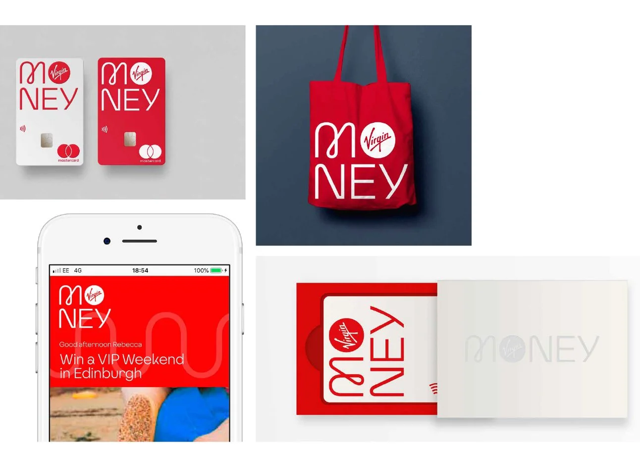
The task was to create a new identity that would position Virgin Money away from the often faceless, corporate look of most banks and financial services companies. The brand identity needed to reflect a people-focussed approach to banking, with digital at its core. Crucially, the identity needed to work seamlessly across all applications and at all sizes, from mobile to storefronts, sponsorship assets to credit cards.
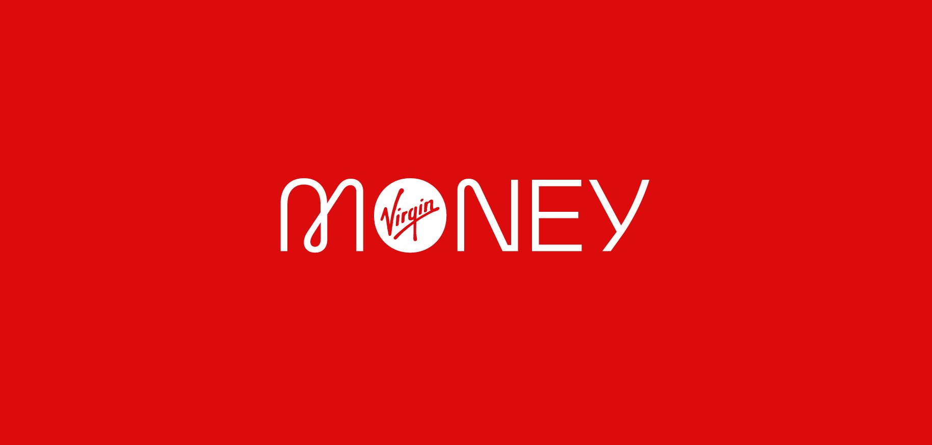
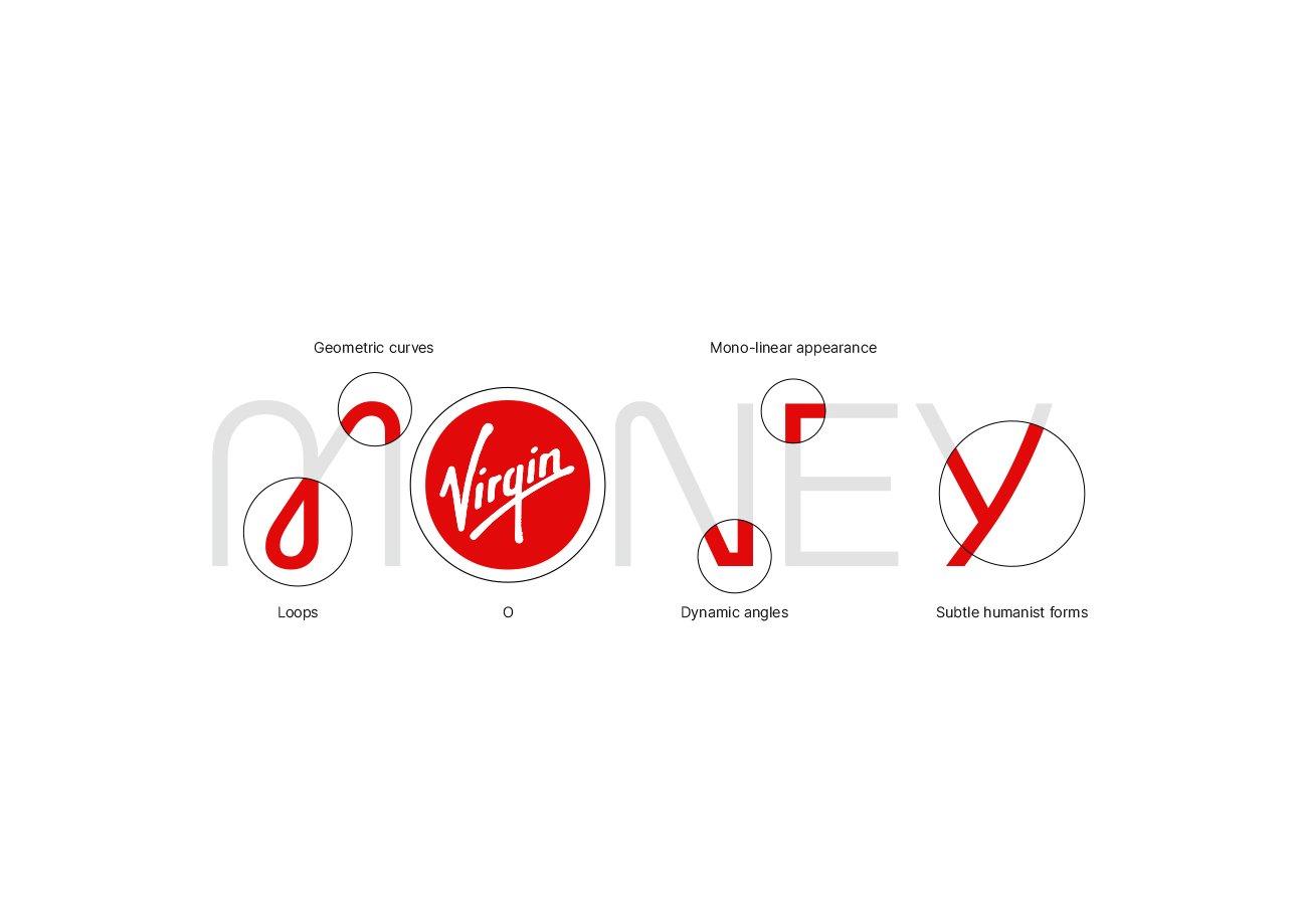
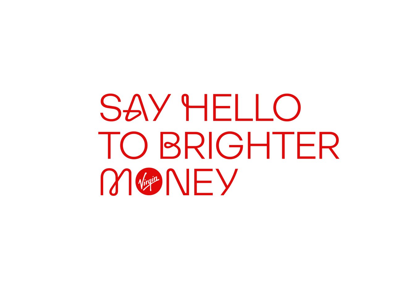
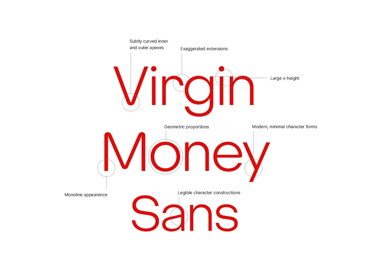
I worked with the Pentagram team to create a bespoke wordmark—a geometric logo from which the wider Virgin Money headline font family and pattern were built. The balance of the mark has been carefully crafted – its human details reflect both the modern, forward-thinking values of the brand and the people at the heart of everything Virgin Money does.
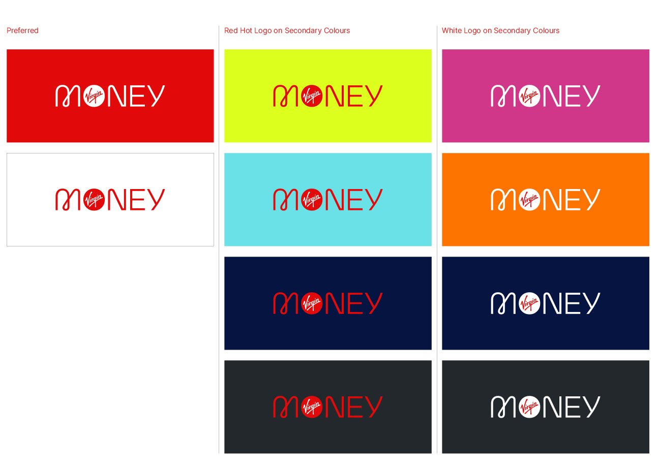
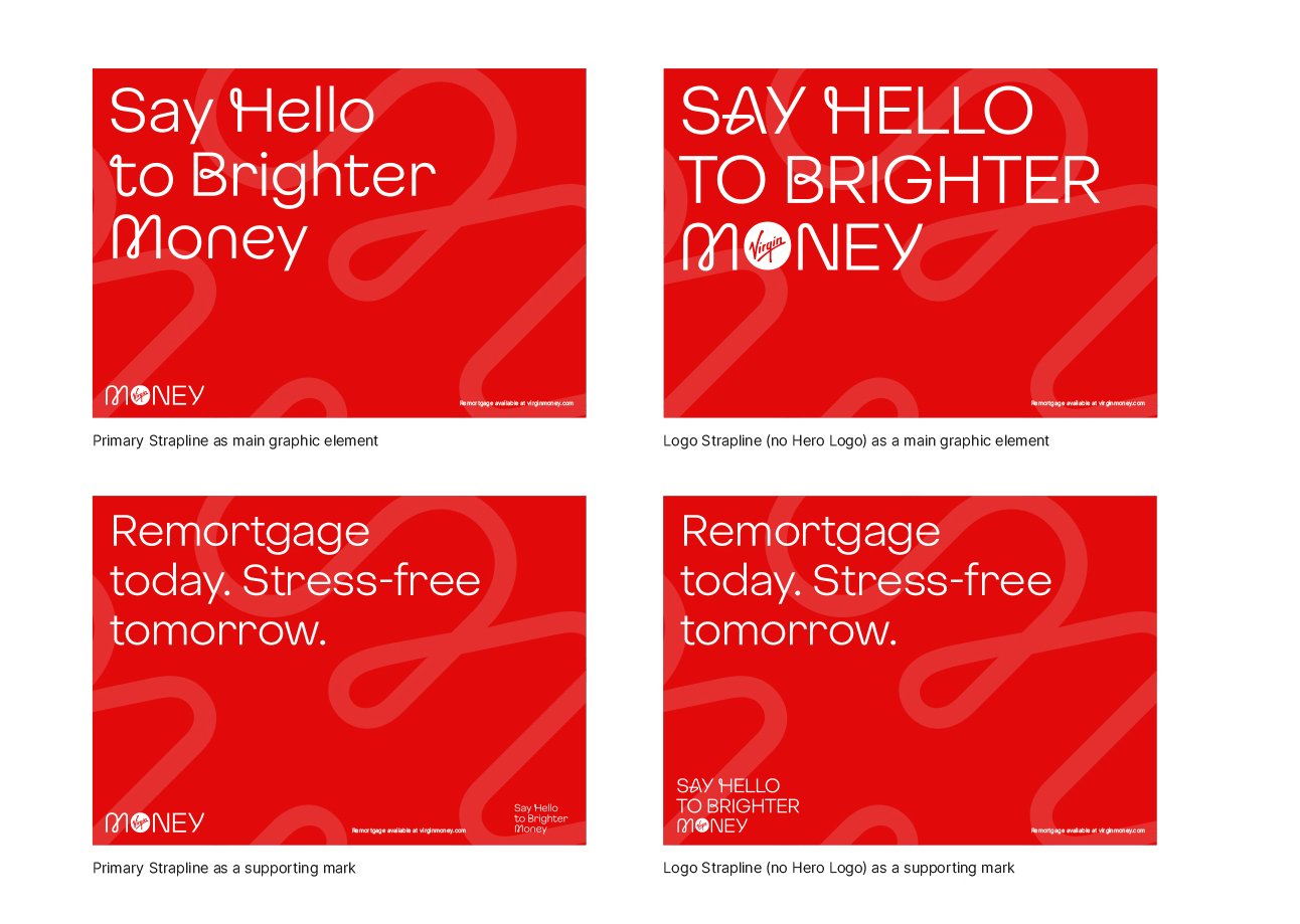
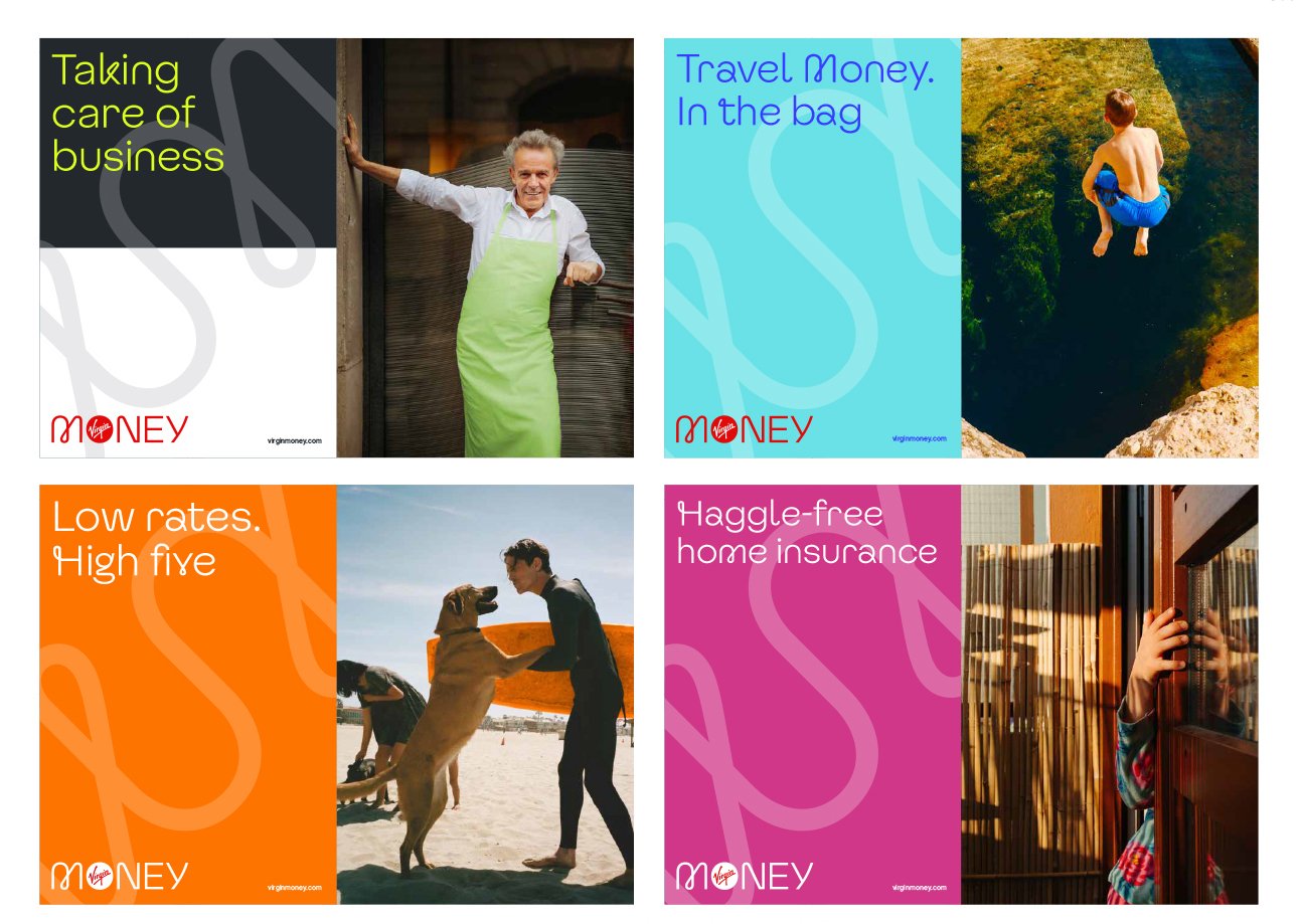
Virgin red is the brand’s primary colour and is the cornerstone of the Virgin Money brand. The secondary brand palette created by the design team is vibrant and energetic, designed to respond and adapt to any new brand message.
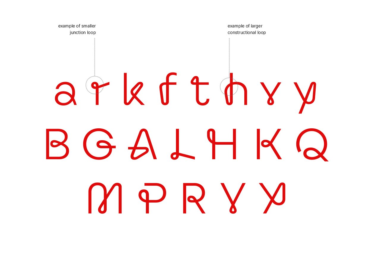
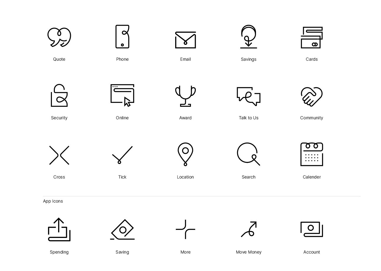
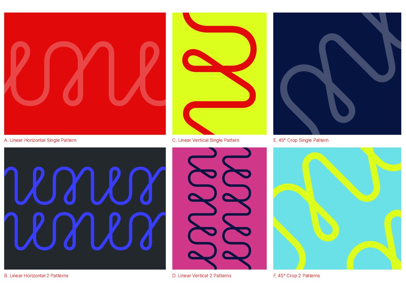
Bespoke patterns based on the Virgin Money ‘M’ were introduced across the new identity. These can be used as a unifying design element across physical and digital applications - scaled, cropped or overlayed on photography. With the bank’s emphasis on digital, the team also designed a new set of icons for use on Virgin Money’s relaunched website and app. These mirror the brand assets, using loops and humanist geometric curves.
The new identity also extended to the bank’s physical spaces, creating welcoming stores that anyone can use (designed by I-AM). The vibrant colour palette and large-scale patterns give the stores an energetic, modern feel. The Virgin Loop typeface used throughout reinforces the human and informal feel of the physical spaces.
Virgin Money offers a new High Street banking experience combining trust with a playful people-centred approach. Working with Pentagram we created a distinctive and flexible identity which celebrates this.
(collaborator: Pentagram)